The brief:
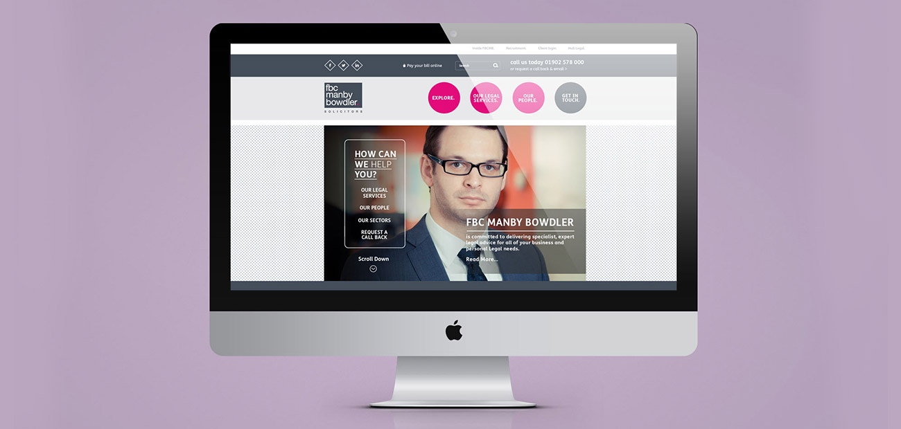
Design a new parallax themed website to enforce the new FBC brand and visual identity.
The response:
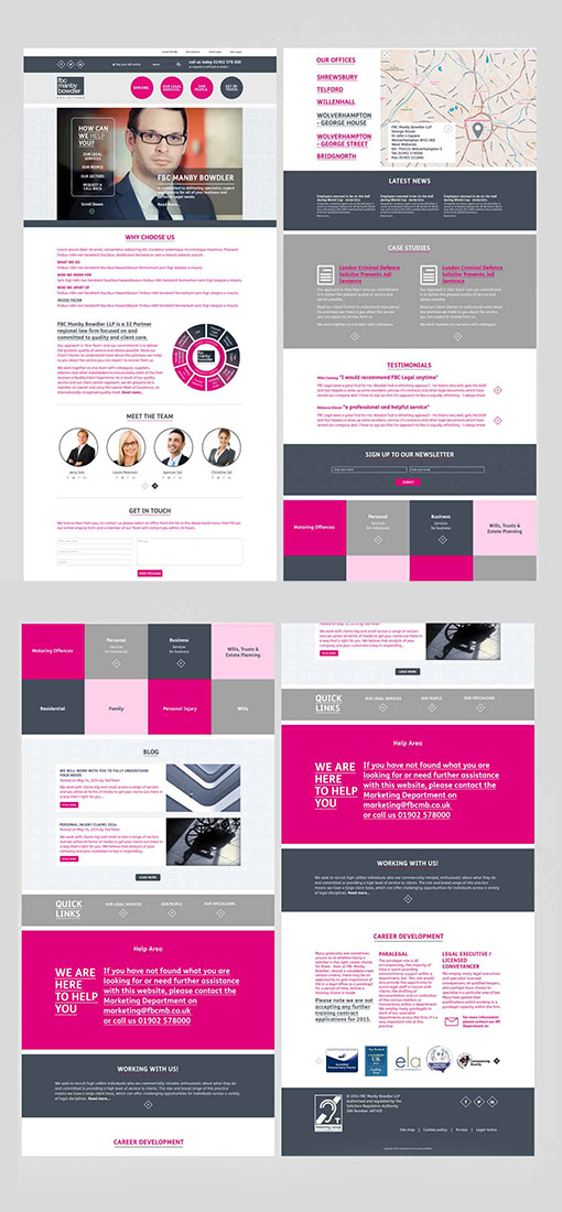
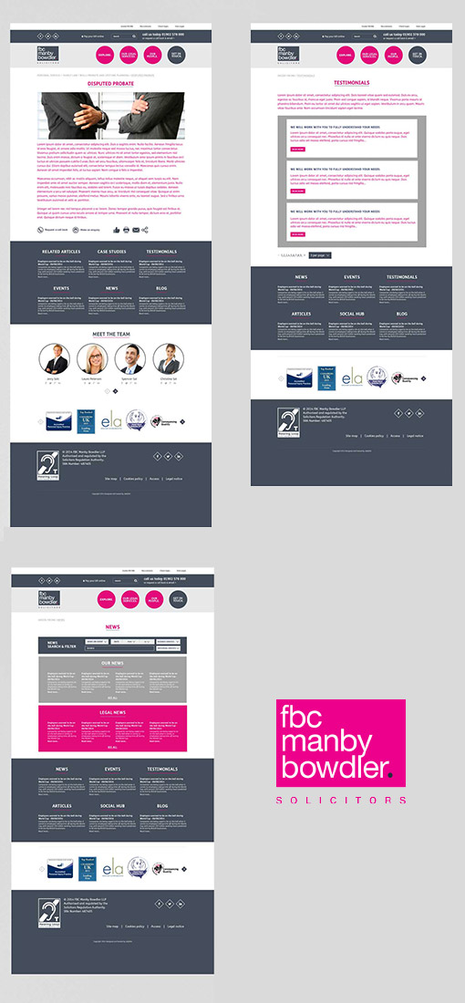
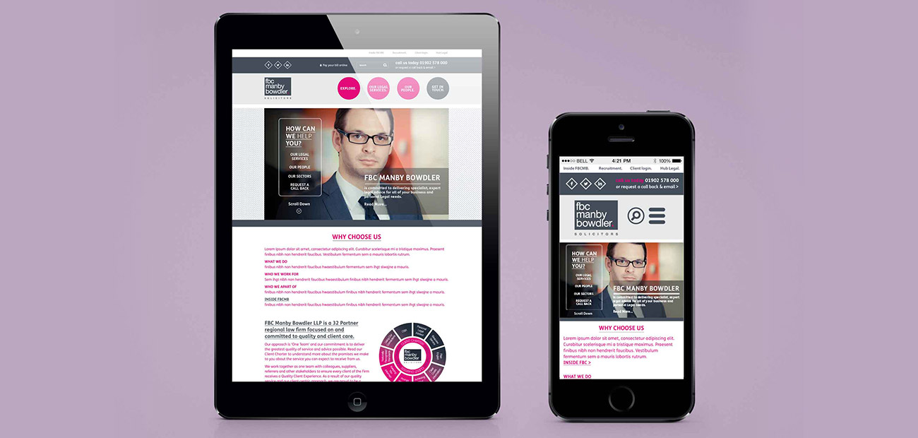
A simple, bold UX design, using a long single page parallax layout with animated links and sections that smoothly scroll in and out as the reader moves down the page. The subpages all use the same static template thus keeping things simple, user friendly and easier to navigate around.
This project was undertaken during my professional employment in 2014 at Jellyfish Creative.
![]()
April 3, 2021


