The approach
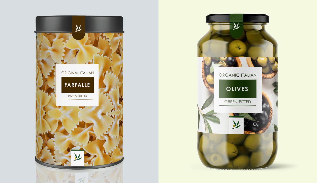
I began by researching the brand, looking at all existing visual assets including packaging, digital assets and advertising. I then worked through a brand comparison, researching competitors in the market and how they differ to Bevelini. From research I found that Bevelini had a very classic look that gets lost in the noise of consumer products. To give them prominence they simply needed to put a contemporary, bold and simple spin on the existing visual estate.
The response
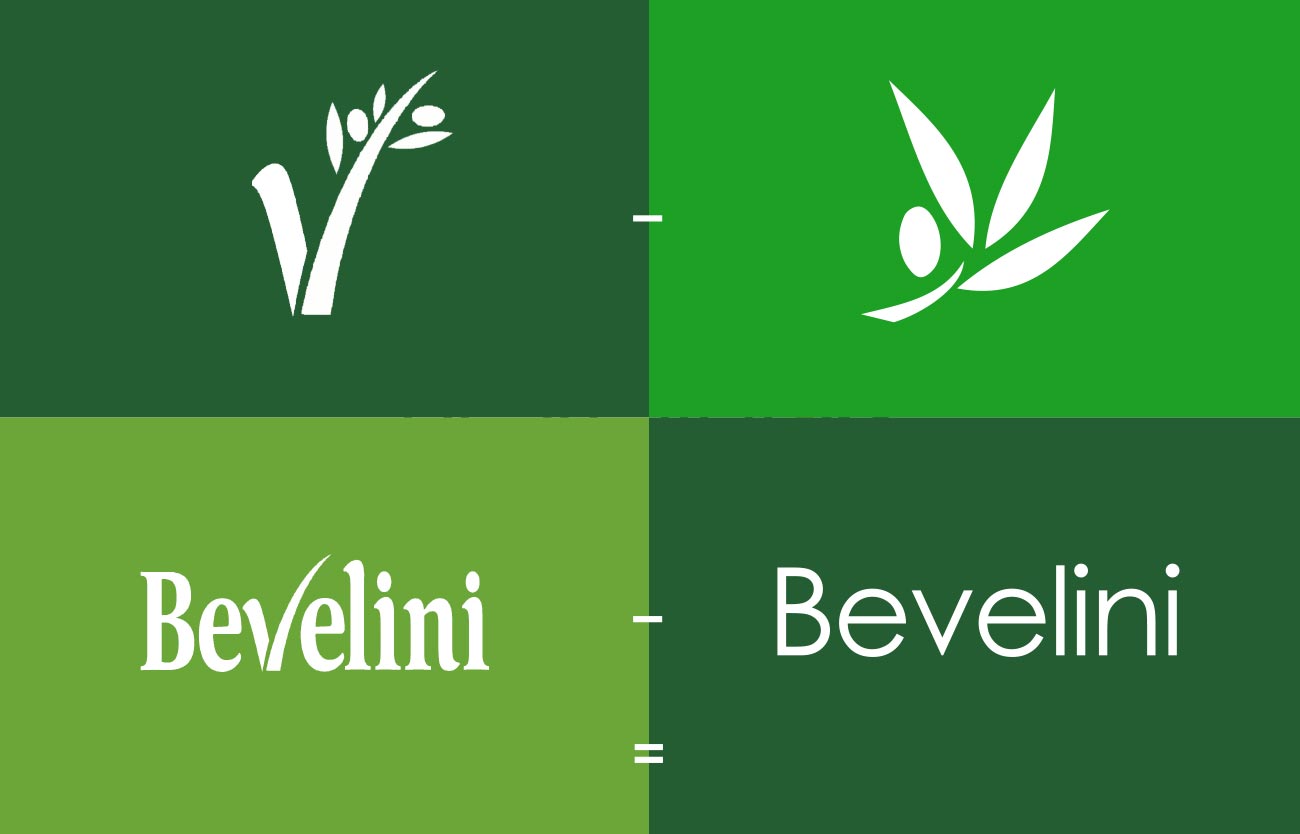
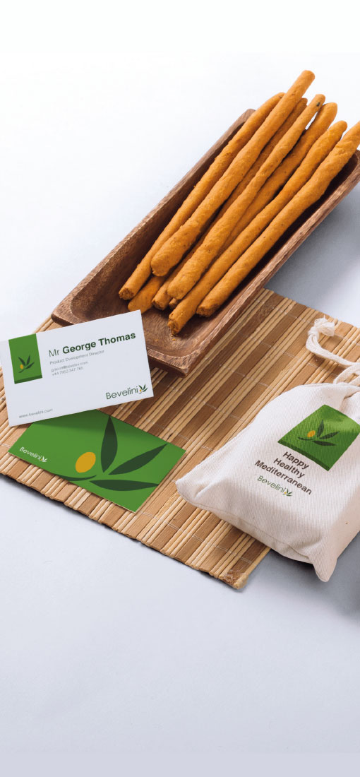
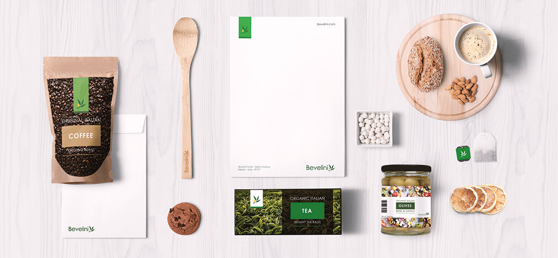
After many literation’s I came up with a concept that simply took the existing logo and evolved it to a simplified clean ‘mark’. I did this by redrawing the olive branch and reformatting the word mark using a modified rounded san serif font. Once this was signed off I then began working on application methods including imagery and photography style as well as packaging design.
