


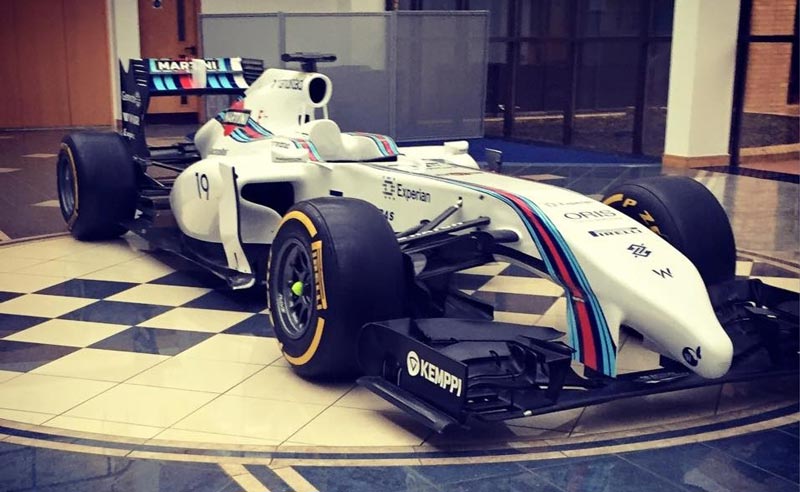
Williams at the Goodwood Festival of Speed 2015
This year was the first time I attended an event with the Williams F1 Team. At the event I had the honour of manning the Williams stand with my colleagues and interact with all of the amazing Williams fans as the team ran the 1990 heritage FW13B car and displayed the 2014 FW36. Below is a video of the FW13B on the famous hillclimb course driven by Felipe Massa at the event.
Williams F1 Social Media
According to Formula 1 Social Index and Digital Sport, Williams F1 social media ranking is pole position within the sport. Its nice to see all of our hard work in the digital team is paying off and being recognised!

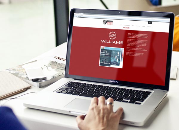
Williams F1 New Website Launch
Since my start at Williams I have had the privilege to work on some amazing projects. The first and largest project has been the design, launch and continuous development of the Williams website. In March 2015 we launch the new web estate following a close collaboration with new technical partner Avanade. www.williamsf1.com
Williams F1
Today I have officially started my new role as Digital Designer for Williams Martini Racing. Over the past 2 months I have had the pleasure to work with Willams and Avanade to refresh and modernize their website. New site coming soon!!! www.williamsf1.co.uk

Red Bull Racing 2015 F1 Car
Due to my recent recruitment with Williams Martini Racing I have become more acute to the world of F1 and the creativity that flows within it. This month whilst researching F1/ racing digital media I came across the images from the launch of the 2015 F1 cars and was immediately wowed by the new look of the Red Bull Racing RB11 TEST car. Instantly you can see the dramatic difference of the black and white tribe style livery, a stark contrast from their traditional design. In my opinion it looks brilliant but can not help thinking it looks more like the branding of their rivals Relentless Energy than Red Bull. What do you think?…
SONY be moved parallax design
Here is a highly creative and beautifully executed parallax design for Sony's be moved campaign.#sony #parallax #conceptual #webdesign SONY

NEW FOR JELLYFISH 2014
Over the last 2 months my team was given the task to re design and re build our Jellyfish Legal website. The brief included an animation, web design and a whole lot of content population. The design of the site has been influenced and designed around an isotope wireframe, giving the structure a fluid and fully responsive layout. For the animation I carefully married up the fluidity of coloured inks with the jellyfish message to give a clean and clear message incapsulating our liquid approach ethos. https://vimeo.com/105560800
Photoshop background image
Here's one I made earlier
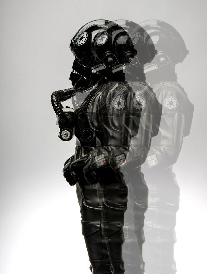
storming image of a stormtrooper
A nice little find off of pinterest of a stormtrooper type figure, edited and stylised by my self for my own personal use. pinterest.com
Stunning Photography by Alex Telfer
This week my Creative Director Mark Robson kindly introduced me to the work of his friend and top 5 award winning photographer Alex Telfer. Visit www.alextelfer.com and fill your boots with some truly stunning photographic eye candy.