New Race & New look!
This weekend at the French Grand Prix, you might notice the Williams FW41 and team all look a little different
New Ruby+Ed SS14 Collection is now online!
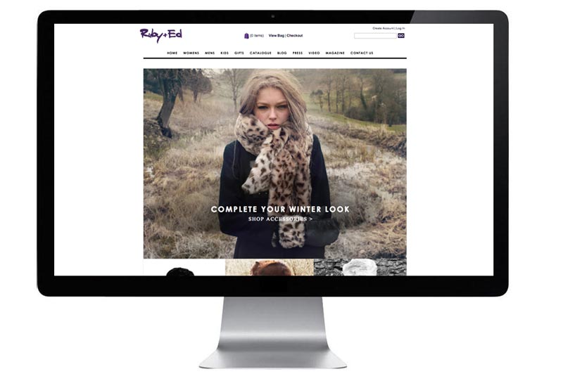
The new and fresh web wireframe exhibits the Ruby+Ed’s new slipper, footwear and clothing collection. As you can see from the design / layout of the site the concept is cleaner, fresher, bigger, bolder and more user friendly compared to previous
Ruby&Ed February SALE
A fresh new homepage layout for the Ruby+Ed February sale. Click to view live site
AllSaints
A Lovely Allsaints video illustrating a brief history and culture of the music from south London. New Music Cities I South London from AllSaints on Vimeo.
A Water Colour inspired landing page
This months Ruby+Ed landing page is dedicated to our beautiful ballerina slipper collection. To help enforce their beauty I decided to give the look of the page a new lease of life by using water colour images and sketches drawn
RUBY&ED ANIMATED WEB LINKS
For this Ruby+Ed home page I decided to inject some movement into the design. Visit the site, hover over the black fur image on the top right and see it come to life. (effect not compatible with mobile devices) www.rubyanded.co.uk
October Ruby&Ed AW13 WEB UPDATE
Ruby+Ed October AW13 home page update. www.rubyanded.co.uk
Ruby&Ed AW13 web update
Example of the new Ruby+Ed september AW13 home page and landing page update. www.rubyanded.co.uk
Ruby+Ed Autumn Winter Video
I hope you all enjoy it as much as I did creating it! Please share.
HOLD+COVER
This week saw the launch of the Hold+Cover student advertising campaign. Here is examples of the artwork that hit the Universities and social media


